 This week’s pick of the week is Summer School by Tam Ames with artwork by Anna Sikorska.
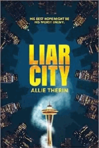
Why did I like the Summer School cover? Well, first off, the placement of the photos is interesting. I especially like the blond guy in the back. He looks soulful. He looks like someone I want to get to know. He’s got great body language and expression. I want to know his story. The brunette guy not as much, but that’s just because he’s a bit more generic good looking, random stock guy. This, however, is not a slight on the artist at all; this is just how it is. Take it from someone that slogs through thousands of pictures looking for artwork, there’s a lot of generality out there in the stock world.
I’m reasonably sure there’s a reason for this, mostly in that, for the photographer it’s probably a bitch and a half to always think of new, interesting poses that aren’t hideous to behold once they’re actually seen. Unless, of course, you’re one of the savants that just has that natural eye and slightly off kilter vision that gets you the cool poses every single time. Then I envy the pee out of you.
So as far as finding the perfect picture in the stock world, sometimes we artists just have to go with the best we can find; especially, if we’re under time constraints.
However, that said, random stock guy doesn’t detract from the cover so much as he just seems a tad bit awkward. I think it’s probably the fact that he seems as if he’s lost a leg, but then you can see the other guy’s leg through him at the bottom. I don’t know what the full picture of Mr. Brown looked like in the first place, so he could very well have been cropped that way in the first place, which does happen. Unfortunately, I’ve been there with that same situation of awkward cropping and it’s not fun at all, because, as an artist, you are now obligated to figure out how the hell to fix it.
Like ringing a dinner bell on a cattle ranch, here comes the frustration, the irritation, and the million questions that go tromping through your head like tiny annoying elephants that you just can’t quash. Do you lop both of their legs off? Do you leave them both on and hope they don’t look like a tangled mess? Or do you cover them up with another picture of water that ties the top and the bottom together but makes the really beautiful and very seeable title disappear? These are just a few things that we as artists have to contemplate while putting a good cover together.
It’s pretty much enough to drive you crazy.
Besides the legs, I might have made the brunette man a bit larger and give him a bit more contrast as far as his shadows/highlights go, but nothing extreme. Other than that, there are just some very minor tweaks that most artists, myself included, just wouldn’t notice till a few months down the road, or a friend points them out. Looking at the cover art for hours on end can sometimes make you very blind to the obvious. It’s why we get to see such funny-odd Photoshop pictures online. Luckily for most of the authors out there, if you get a good cover artist, you won’t be able to recognize those minor tweaks.
I absolutely love the colors of the cover. A beautiful mixture of icy blues, warmer greens, and earthy beige tones associated with summer, and pools that make me want to take a dip.
The fonts that are used in the titles are perfection. The word “Summer” is classically romantic and flowing but wonderfully readable. The word “School” has wonderful color tones as well but a marked difference with its contrasting straight lines. And both are overlaid with an awesome water texture that delightfully mimics the pool behind the two gentlemen, making the entire title pop without overshadowing the author’s name below.
It’s very hard making two or three completely different pictures let alone fonts look like they all come from the same place. If it were easy more people would have better covers.
For my review of Summer School’s cover art, I think that Anna did a wonderful job.
Have a great day and may the good books be with you!
A.J. – Got You Covered
(Unfortunately I’m unsure as to what the URL is for Anna Sikorska since there were a couple of artists called that online. This is why she is not linked. If anyone knows her or her website URL please let me know so I can update appropriately. Thanks)


What a terrific idea! I dabble a bit, artwise, and it’s always intriguing how people work a piece. Particularly with the advent of all the computer drawing and options thereof. A.J., you had some in-depth things to say here, particularly about stock photography. I’m more used to art scrap used as sketching references, so this was fascinating. Please, keep doing!
Not to mentions it’s verrrry nice to see the cover artists get their own feature.
LikeLike
Thanks for stopping in, J!
This is the second of A.J.’s weekly features, and I have to say her articles are adding a great new dimension to the site. I agree it’s about time the cover artists are being recognized for their talents, and it’s to my very good fortune that A.J. came up with the idea and is letting me share her. :-D
LikeLike
Thank you so much J! Sorry for the delay in replying,I really need to figure out how to get replies sent to my email. *blushes* Computer drawing is awesome. I’ll be the first to admit it, but it takes a very talented person to do a drawing that is realistic enough that you don’t notice the small mistakes.
If you’ve seen the movie Tron 2, think of Jeff Bridges face when he was Clu. The CGI for his younger version was sooooo close but it was off just enough that it seemed kinda bad. It threw off the movie for a lot of people and ultimately hurt sales some. That’s what a badly drawn cover can do also. Same as a badly manipped cover. If you, the reader/purchaser can discern the mistakes and it’s enough to throw you off, you probably won’t buy the book.
That said, I know from my own personal experience that I struggle valiantly against any obvious mistakes, however, they do slip through from time to time. Especially if you’re an artist that tries to give each and every cover a different look and not resting on what you know you can do well. Not only does it get boring to look at, but it gets overdone and eventually guess what? You’re last years flavor and no one is asking you to do cover work anymore.
That’s why I thought we needed a little shout out for the cover artists. It’s a tough job. I don’t think a lot of people have an understanding of how hard it is. The vast majority of people think, oh you sit at a computer and slap stuff together. Wrong. It takes creativity, a huge amount of attention to detail, and we don’t get betas to help us! Though I personally bug my friend all the time to tell me if she likes something but that doesn’t count. ;)
I’m so glad that you’re liking my offerings so far. I hope you’ll come back often. I promise to reply in a more timely manner! :D
LikeLike