
You know, when Lisa, the wonderful owner of The Novel Approach Reviews said, “Hey, cover reviews are cool. Go right ahead,” I got really lucky. Not only does she let me rattle on in my dubious wisdom, but she allows me freedom to write about things outside just the covers that I fall in love with; which, in turn, lets me write about covers that are outside the M/M genre we all know and love.
The reason I do wander off the beaten path on occasion is that I wander the web A LOT and in doing so, I stumble over many beautiful things. Covers, fonts, the relationships between the artists that are hired and the authors that do the hiring, and the end results that can make all of us swoon with desire, smile with glee, or keep us moving right past a masterpiece in the making.
And I love her for that. Hear that, Lisa? I LOVE YOU, SWEETIE!!! (In a purely platonic, friendly way, of course). *cheeky grin*
So yep, yesterday I was looking for books for a Typography class, which I found out that I had taken before and no longer needed the book, but by happy accident I stumbled over these beauties. How the hell I went from a book on Color Management to this I’ll never know, but there you have it. I seem to navigate the web much like I speak, all haphazard and messily but usually finding a hidden gem somewhere. And while these might not necessarily be hidden gems to others to me they are.
So we’re going to discuss, got it? *grins*
To say I am so very, very in love with these covers would be an understatement. Seriously, Romeo has nothin’ on my amour! The illustrations, the fonts, the colors, the whole complete package. *falls over dizzily* Stunning.
Anybody who knows me well knows I’m a huge history buff, and that extends to art, architecture, fashion, etc. Pretty much anything that has any historical interest, I am your Johnny on the Spot! So that right there should let you know that I’m going to love the whole Victorian/steam punk genre.
While I’ve known of the steam punk books out there, I’ve never actually went looking for them or their covers, which is kinda weird seeing that it mixes two of my passions: historical based stories and reading. Anyhow, now I’m kicking myself in the ass ’cause while I don’t know about the stories inside, the covers certainly make me itch to buy, and these covers are seriously the next level. These covers, much like Miss Dante’s and Miss Chase’s covers, are what I’m aspiring to. What all newbie and fledgling cover artists should aspire to – pure undiluted wow factor.
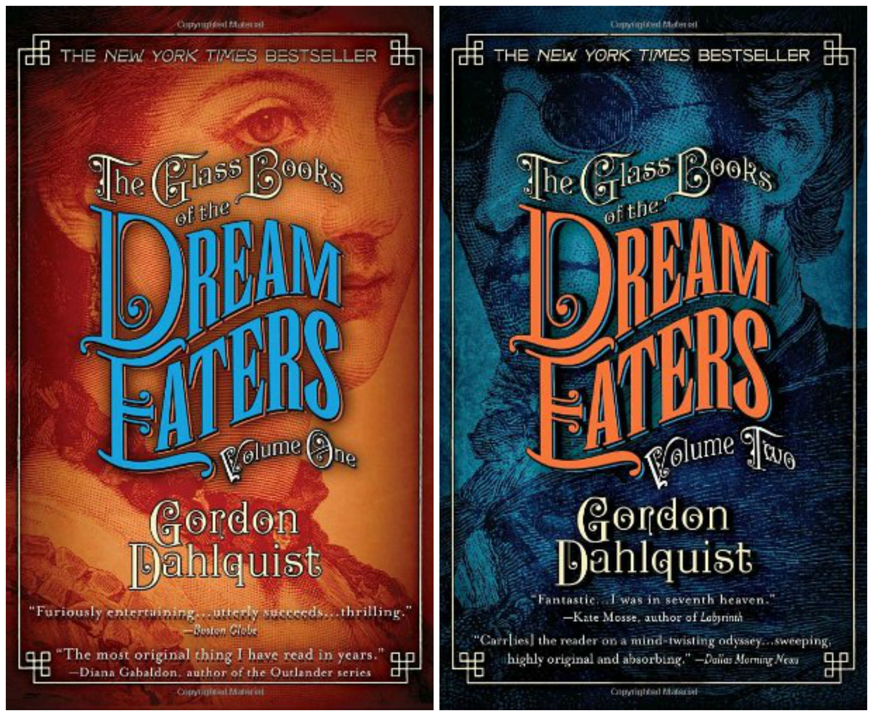
First off lets talk about the choice of colors.
You’ll notice that the orange/blue theme is quite prevelant in both the Dream Eaters covers, and it carries over to the Whitechaple Gods cover even though it’s more subtle. It’s no less dramatic, just more understated. This color combination is a good representation of one set of complimentary tones on the color wheel , so they naturally look superb together. Throw in a little black here, a little white there to add depth and drama, and you’ve got a magical cover. It especially works well on the Dream Eaters books, volumes one and two, though the burning effect in the chest of the man on WG’s cover is really cool and definitly has flair.
As for the fonts, the font on the Dream Eaters covers is just what I’d imagine to fit the time period that they are representing, ie: the industrial period. They’re fancy but not overly so. The font is easy to read also and with fancy fonts that’s hard to do. They tend to get to busy and either thoroughly distract from the cover, or they’re incredibly difficult to read. Plus, the artist threw in the interesting wave effect with the framing around the whole of the wording. But you still see the picture in the background. Nor are you overwhelmed by a hideous font that just does not match. We EBook cover artists (and authors that try to do their own covers) are very susceptible to this, especially when we’re first starting out. So watch that! Personally, I’m guilty of occasionally leaning towards too boring in my font choices, but the fonts you’re seeing here? These are not boring at all! They’re wonderful and exciting and look like their own art. Which Typography actually is.
I could probably prattle on for another hour about these covers but I’m already closing in on page three so I’ll just leave you with a few more that I loved.

And this actually brings me to the Whitechapel Gods title font. I LOVE LOVE LOVE the illustration. Oh my God, it’s perfection! And does anyone else think it looks like something Anne Cain would make? It didn’t have an illustrator credited, so anyone, please ask Miss Cain if she did this? ’Cause I’d kinda like to bathe in her gloriousness for a moment, if she did. *laughs*
However, back to the font.
It’s so close. Like REALLY close, but it’s missing something. I actually love a clean font, and this has classic lines, the texture is cool, and the color rich and tasteful, but the picture is so fantastic it makes the poor title look plain. *pouts* I hate that. For me the titles are what take the longest because it has to match, and it’s almost a gut feeling that you get when you see the right one, but sometimes you just get frustrated (after the millionth font) and you just say, “Okay, this is the best I can do.” Dammit. I usually close my file for the night and come back the next day at that point ’cause it’s just a lost cause.
But yeah, this is one of those titles that just needs something. Do I have any clue what? Nope, not a one, though I am thinking a fancy little framey effect to house it in might be nice. Hmmmm….
What do you guys think? Is it boring? Is it just right? Or do you hate it?


Until next time, have a great day and may all the good books be with you! A.J.
All thoughts and comments are the reviewers only and not the viewpoints of others. If I’ve made you angry, stepped on any toes, or otherwise ruffled any feathers, I do apologize. This is just for fun, and written in the hopes that it will help fledgling book authors and artists to grow and learn.
Check me out on: Facebook or my newly minted art/personal blog: Seeing Static. Say hi if you’re so inclined, I’ll even answer.


Love these covers!
LikeLike
Thanks Lexi! I was blown away by them and couldn’t NOT chat about them! :D
LikeLiked by 1 person
God, A.J. these are simply a bit of terrific. Love them. I think since I love the twenties thru the forties, I’m in love the most with the last two covers that have that very sophisticated look from that period. Thanks for sharing these with us. Ya done good. Hugs, P.
LikeLiked by 1 person
Those last two covers are actually my faves also. There are I think 2 more in that series? It’s very wood block cut style isn’t it? I pretty much love any era historically speaking but these covers just really caught my eye. Glad you enjoyed sweetie! :)
LikeLiked by 1 person